UI/UX Design for Edudictive
Tools used
Tools used

There has been a recent growth in edu-tech industry in India with the onset of educational platforms like Unacademy and Byju's. These platforms are making online education really smooth and fulfilling for junior school students as well as competitive exams aspirants like IITJEE and NEET. But among the various classes/courses/study plans they offer, the skill development requirements of a students get lost somewhere, specifically for Indian students.
Edudictive provides solutions in the edu-tech domain for school and college students who want to develop their skill in both technical and non-technical categories. It provides training programs such as web development, mobile development, UI/UX design, sales and finance, content and digital marketing, etc. I was approached by the company's founder to design the interface of their online platform. After over 8 months and multiple iterations, I have successfully completed the web design of this product which is currently under last stages of its development and is soon going to be released. Through this article, I am documenting my entire journey learning and implementing about the UI/UX design field.
From the first day, the intent of the product was to target those students who want to build their skills and competency in non-academic fields. For eg. getting a major in Computer Science and developing successful web product using frontend and backend technologies are completely two difficult things. Even though having a degree definitely helps, one can develop a successful product even without it.
I started to define a clear problem statement to reach this unexplored group of students which are not explored by other competitors in the market and ofcouse those who are not providing those features which thinking of releasing.
After a fair bit of research and going across platforms like Coursera, Udemy, Unacademy, Byju's, CampK12 and many more. I got a fair bit of idea about direction we are going to proceed in. Although platforms like Udemy provide skill development courses in almost any field, there is rarely and follow-up or career benefit rate for the users. Other platforms mostly focused on school or college courses and not on acquiring a skill as such.
The various expected stakeholders of this product as per our research can be broadly divided into:
School students of classes 6th to 8th who have just started to explore the various cool things they can try. Parents play a huge role in deciding the programs for their children.
School students of classes 9th to 12th - Since most of the students of this age group are mostly focusing on preparation for competitive exams after their school, it is a difficult audience to reach out.
College Freshers or Sophomores - This group of students are generally found exploring their various options and fields to find which one they are actually interested in. Thus, this was one of the most important group for us.
College Juniors and Seniors - By this time, students are generally either expanding their skillset and are looking for a internships and jobs related to those skills.
These groups have been developed and finalised after various iterations and it's not entirely based on our initial research. Moreover, since I was fairly new to user research and surveys at that time, the team decided to start off with our best guess about the audience and focuses more on building the product.
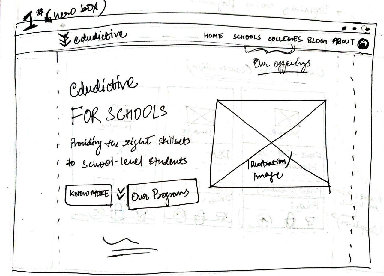
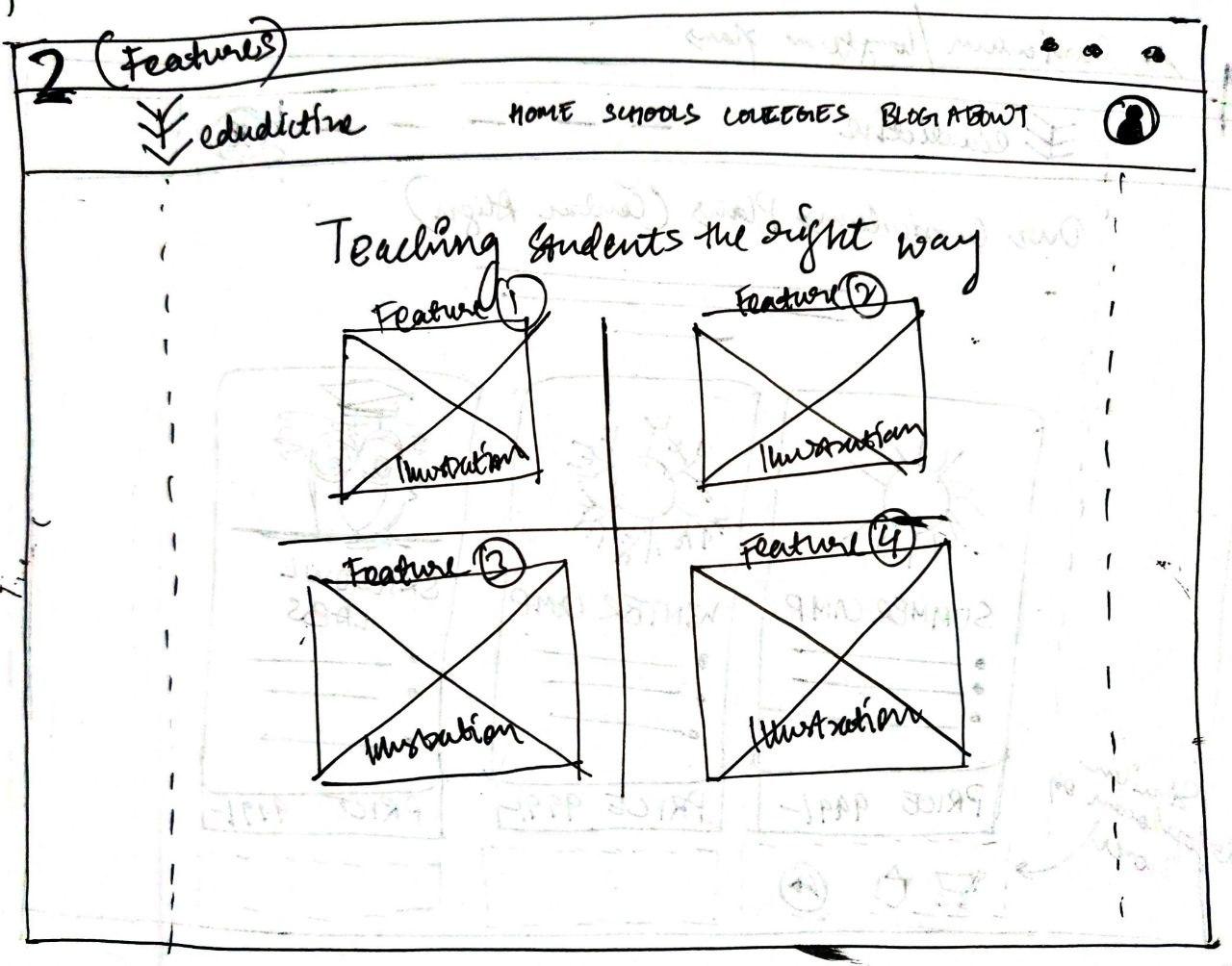
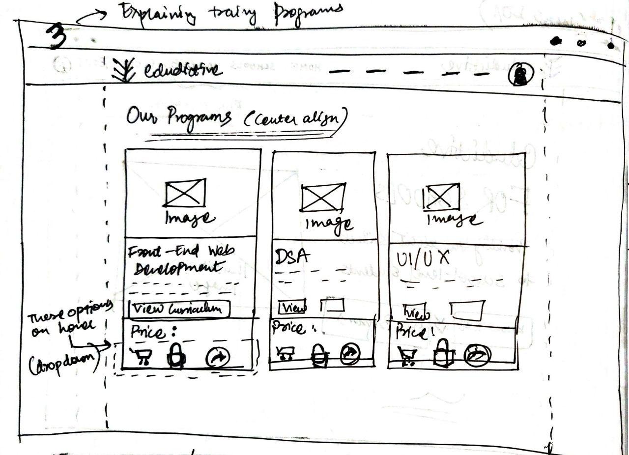
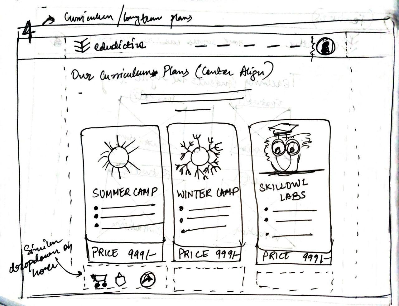
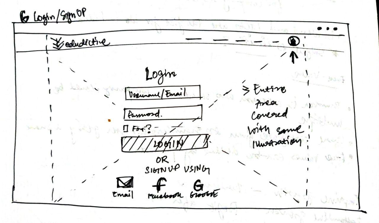
The various sections of the website were layed out in this part of the design process. This was one of the most crucial steps as the developers also needed to get the idea about what I was trying to convey in a very structured manner. This way the backend developers could design the databases and other API integrations easily at the time when the frontend developers have started designing most of the static part of the website.
The team and I brainstormed a lot to work out the information architechture of each page. These sketches are hand drawn and aren't much detailed. They just give a basic understanding of design to convey the idea to the team members.

As this is the first time any online platform for Edudictive is being designed, I decided to make a design system of my own. This is really a big decision, and it took me a lot of time and iterations to finalize with one. For the colour palette, since the brand identity is in blue color significantly, I chose to stick with it as primary color. Moreover, blue colour resembles calmness and serenity and we aimed to establish ourselves as friendly and approachable brand for kids and students. Furthermore, purple is chosen secondary colour. Apart from these, only black and white colours were used. The typefaces selected for the entire design were Avenir and Proxima Nova. The illustrations were gathered from various sources under paid licenses.
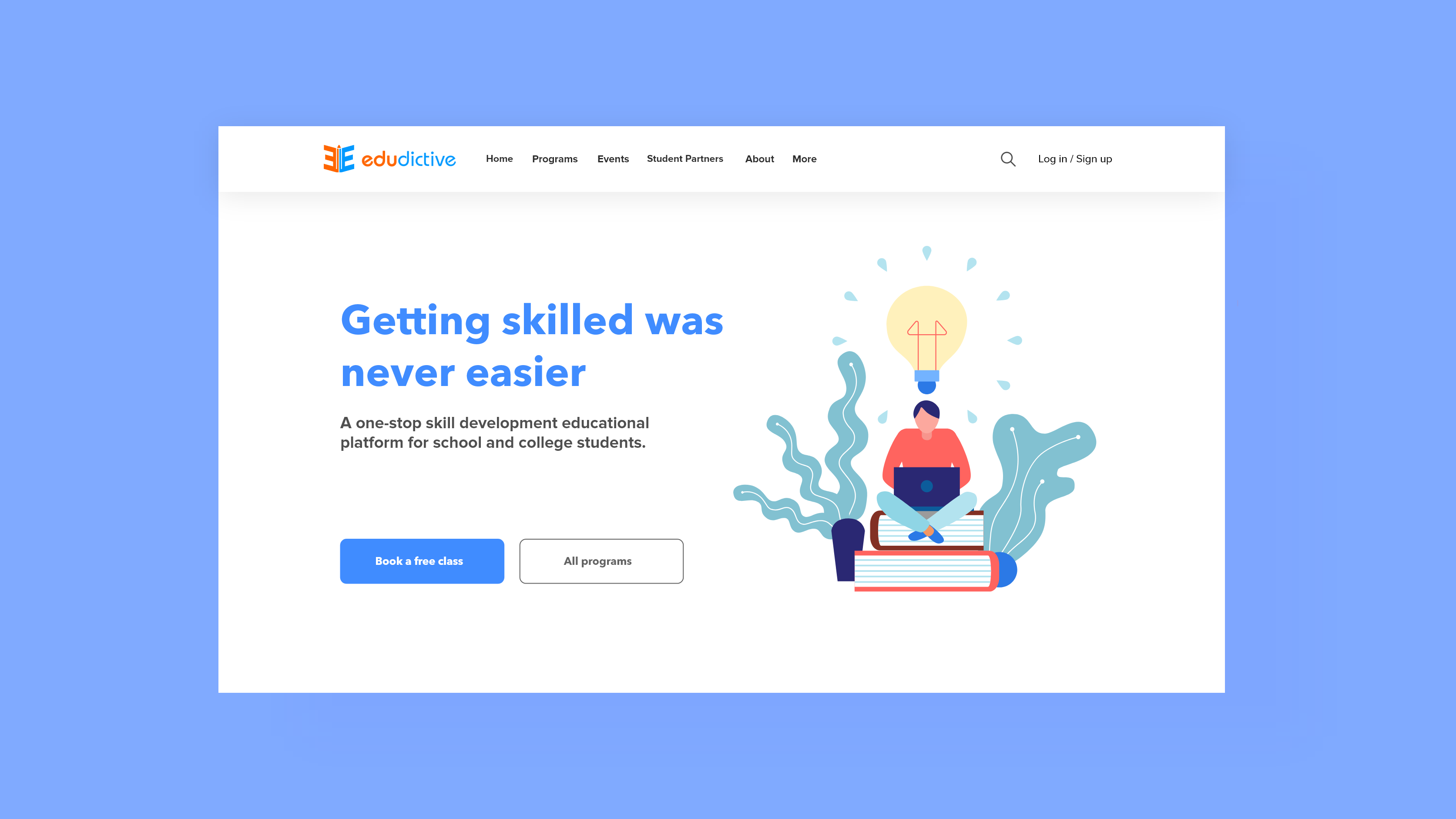
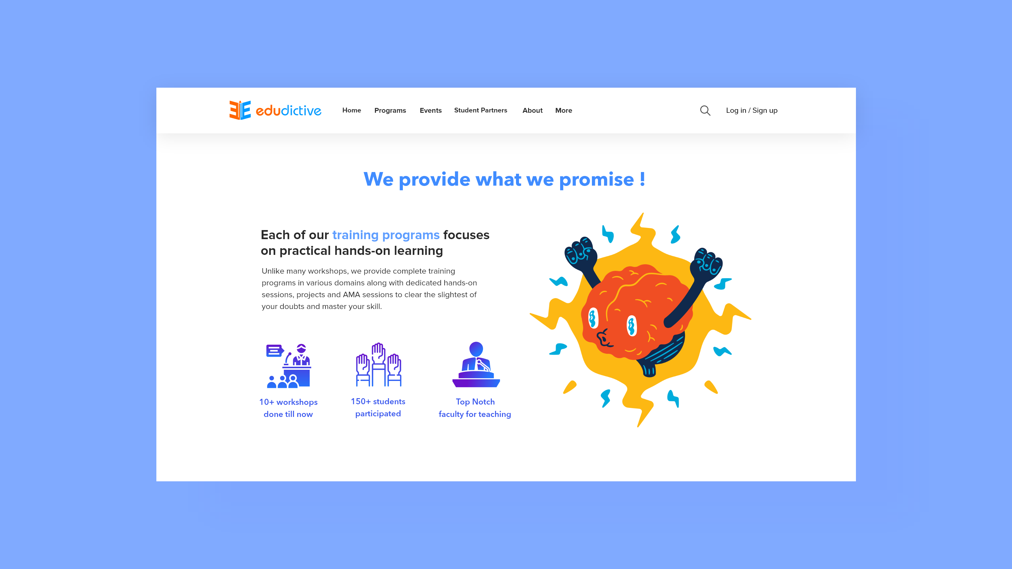
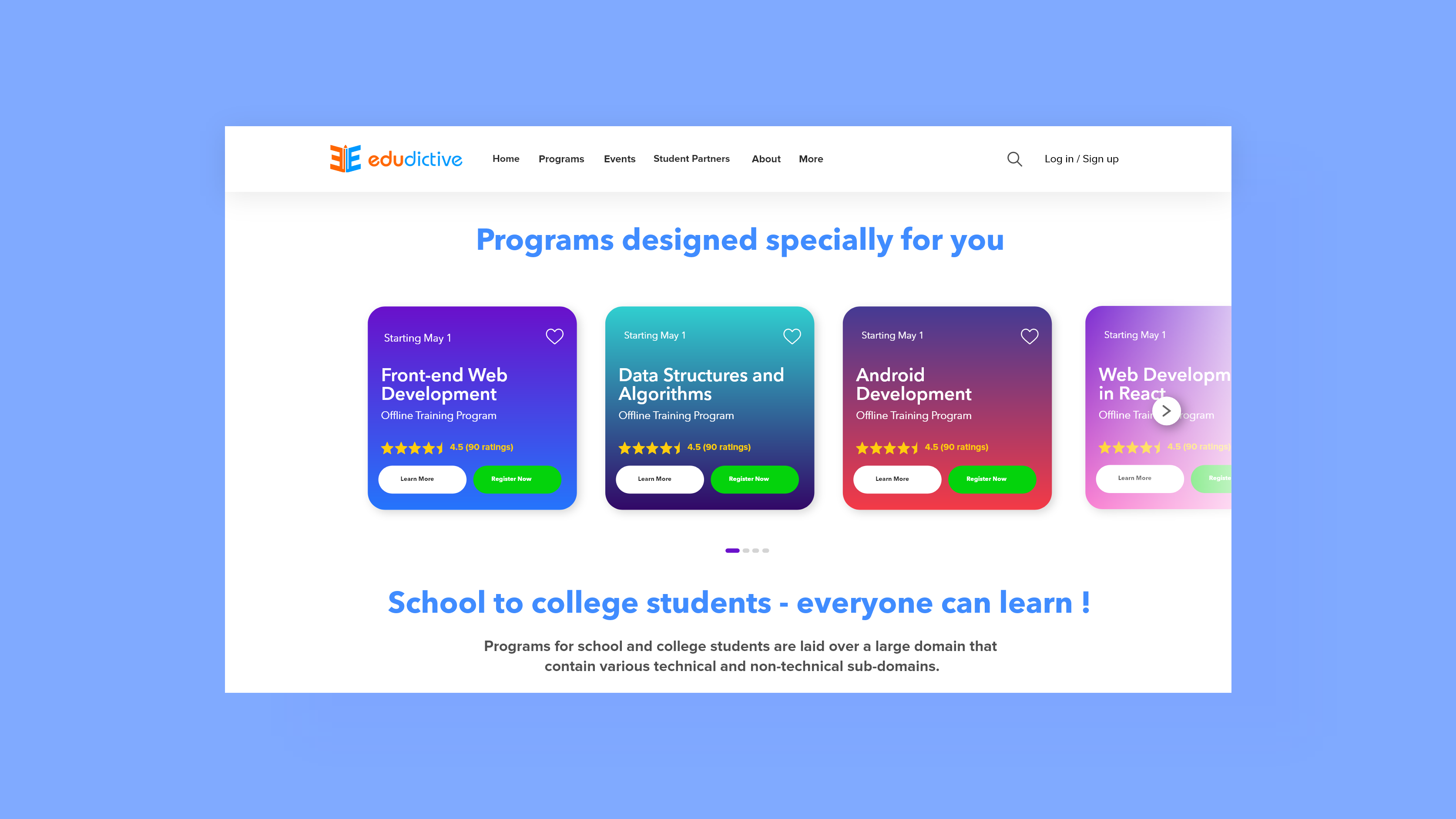
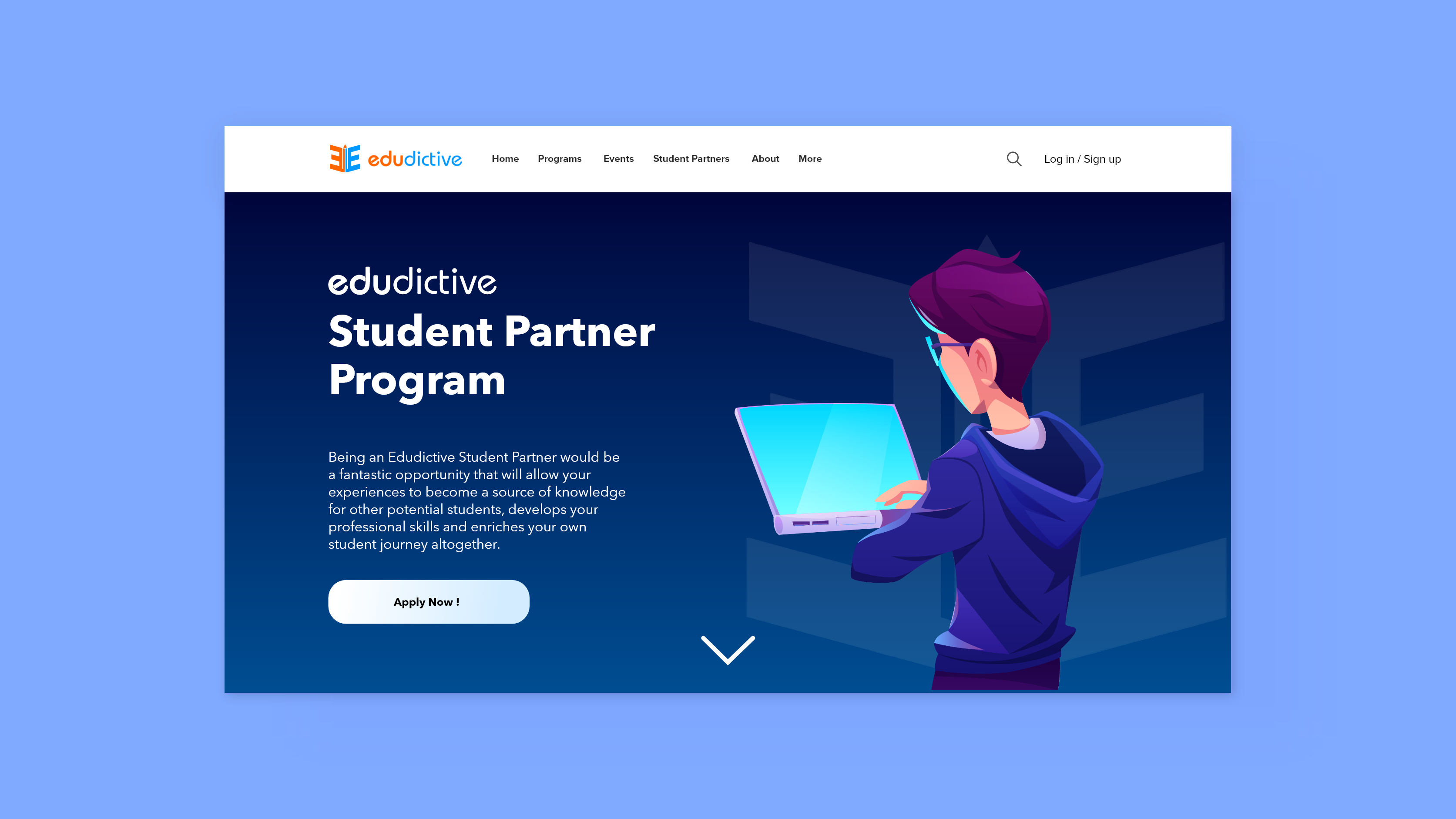
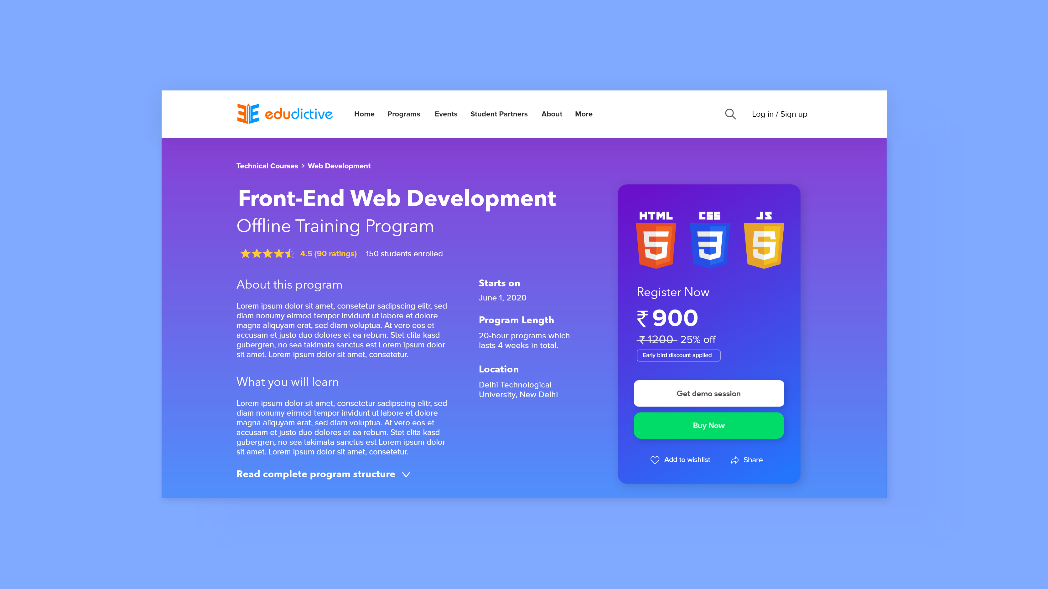
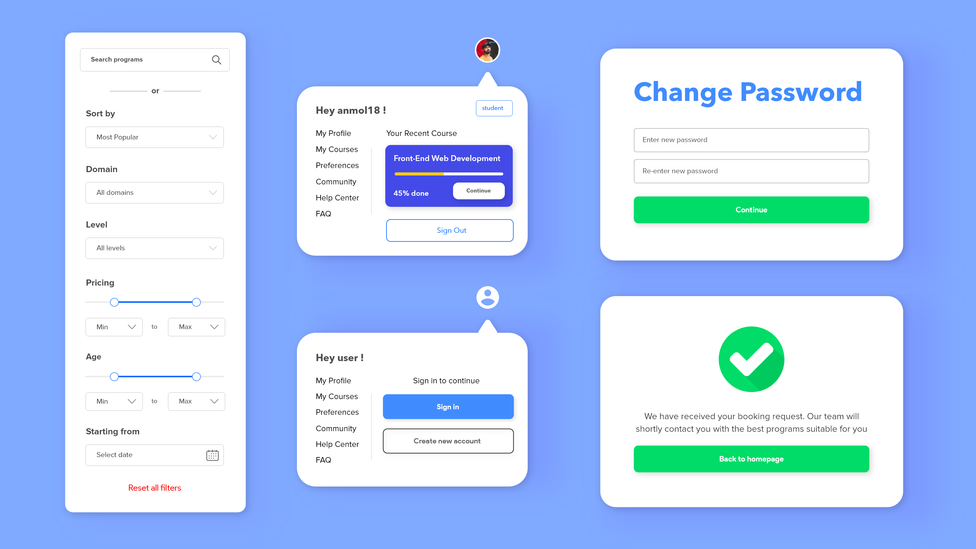
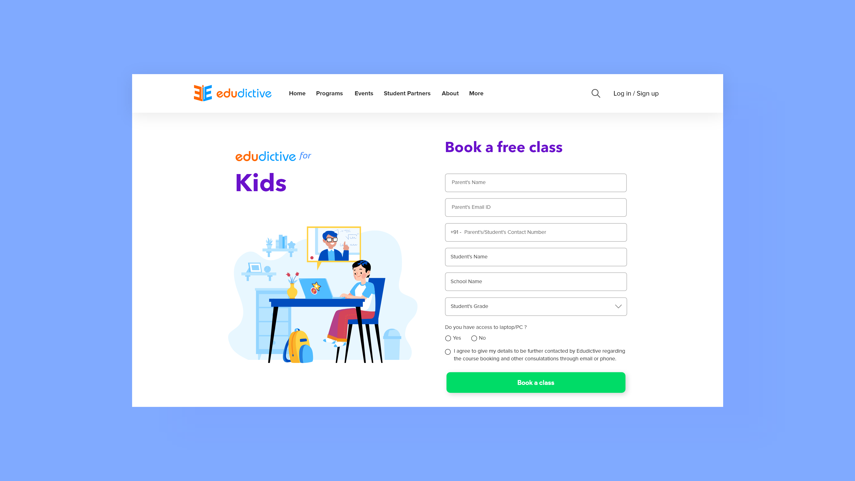
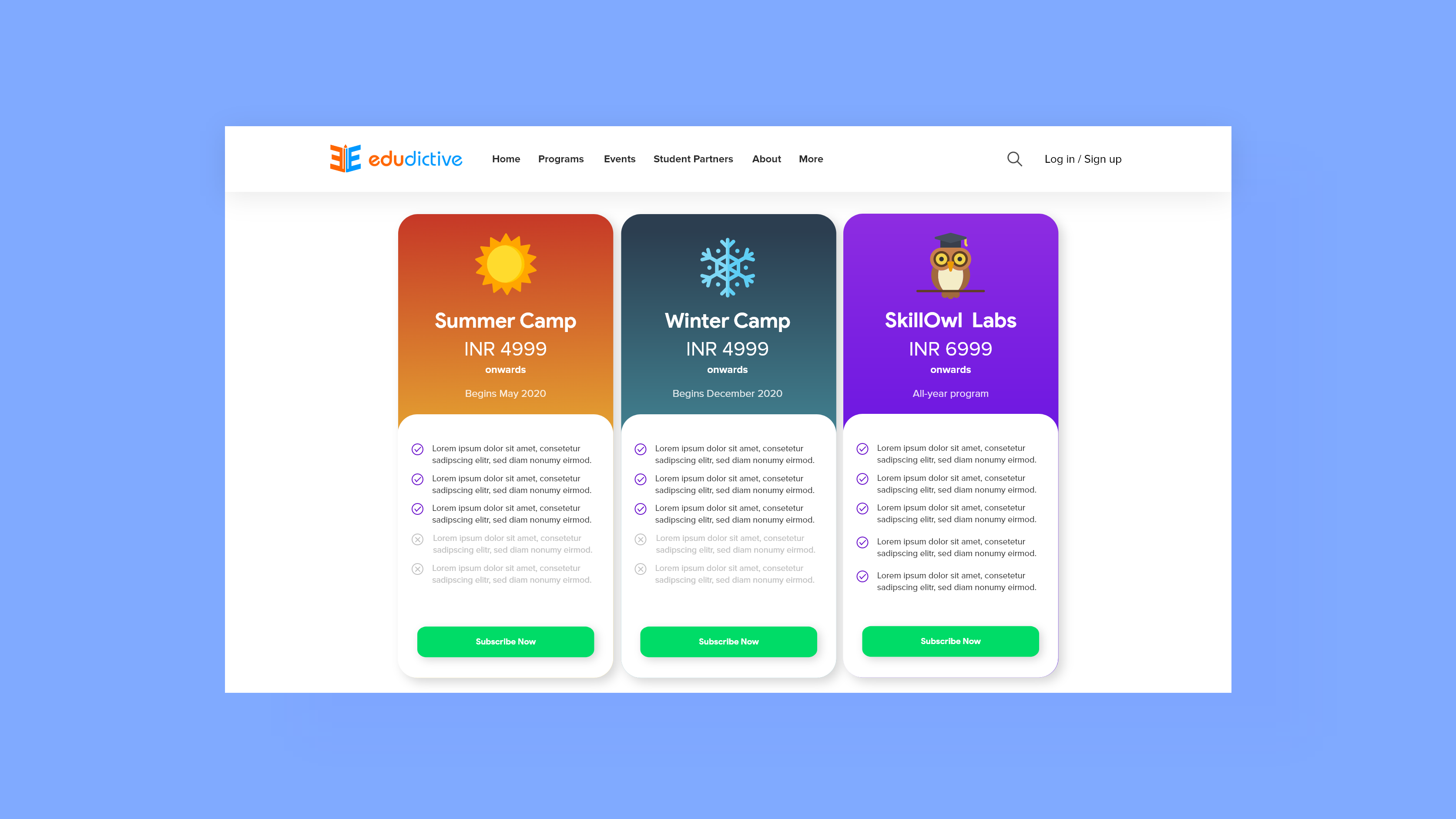
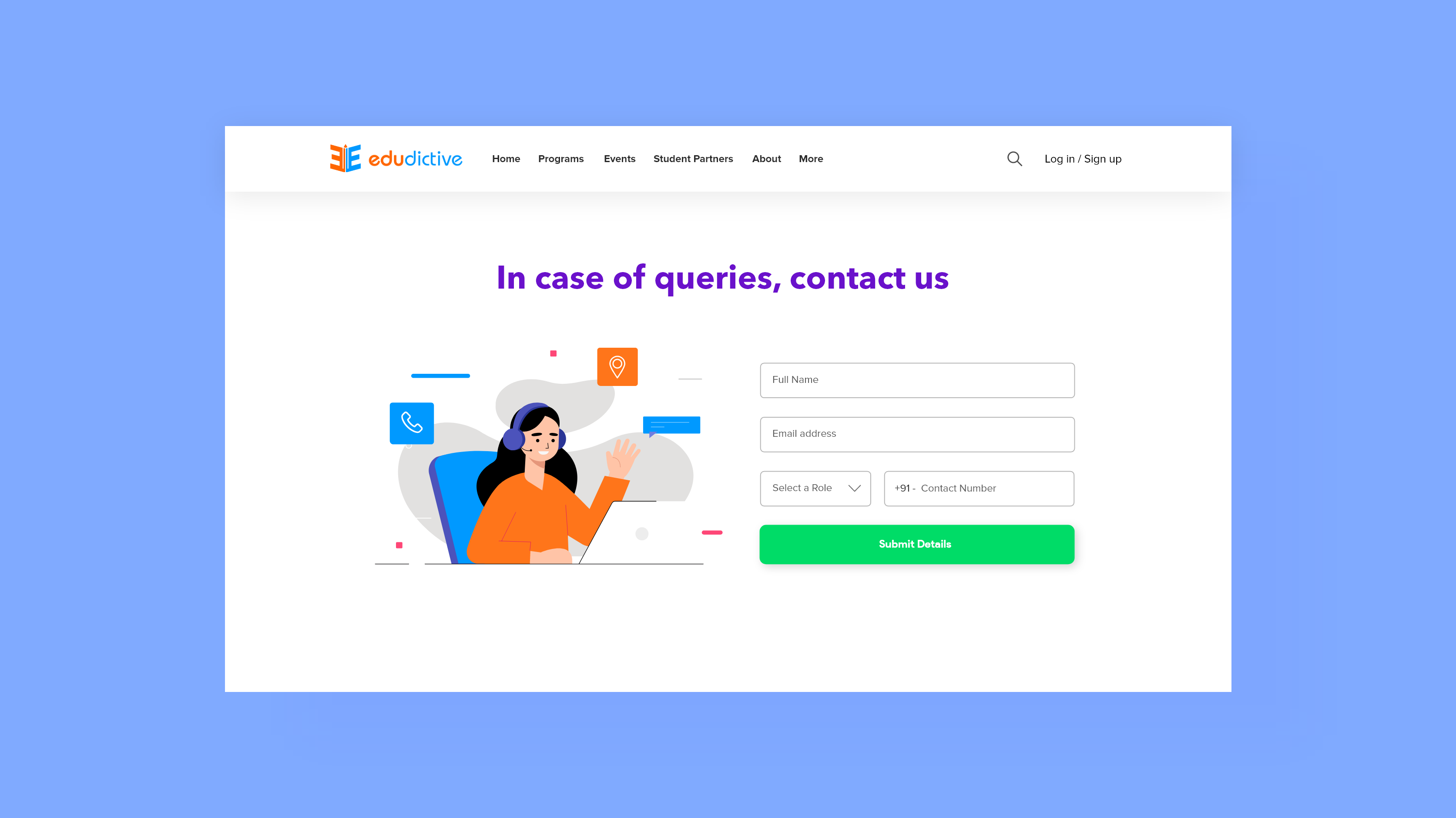
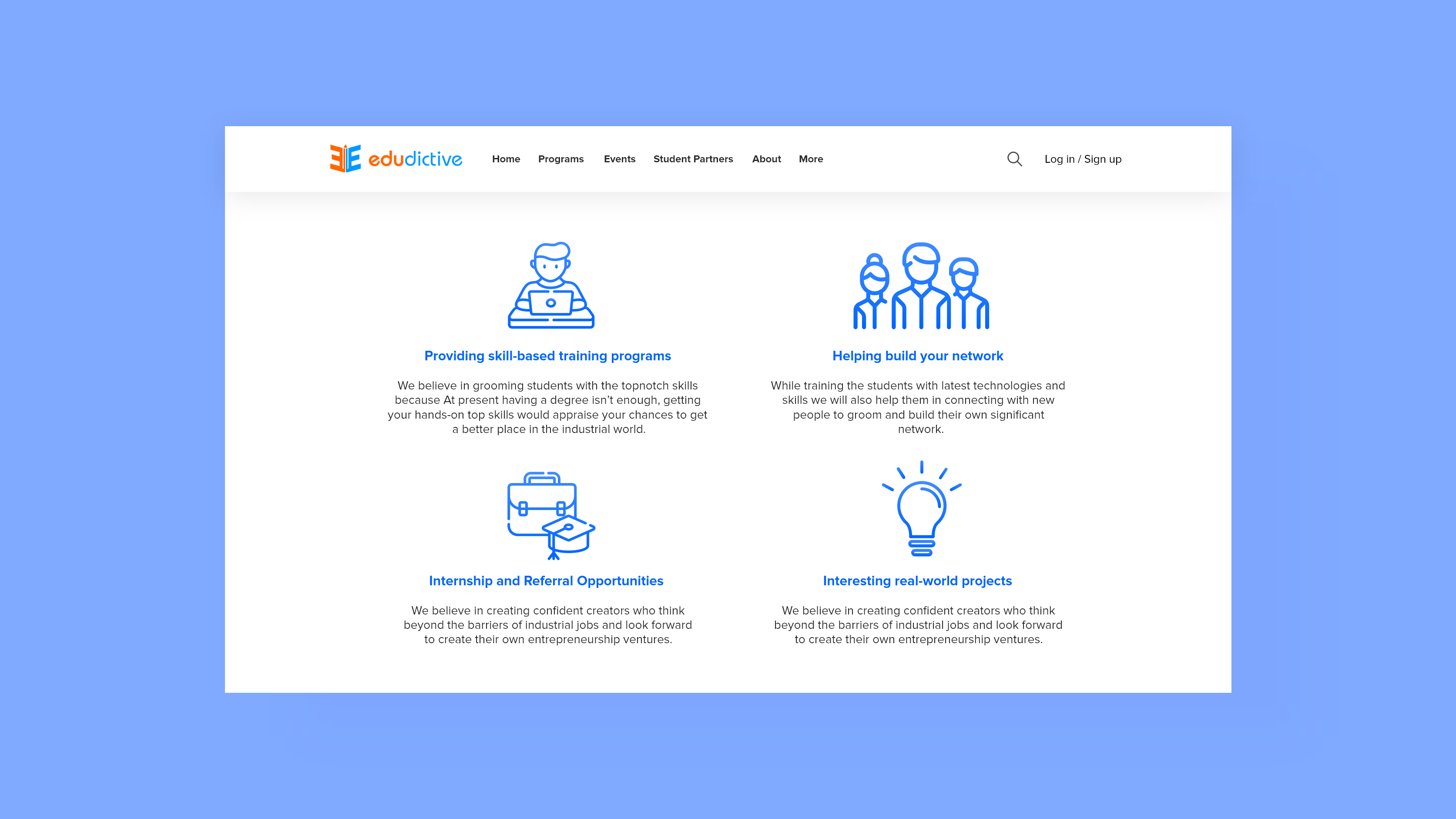
Now it was my time to proceed with the thing I love the most - UI design! The design has almost 32-35 screens in total (which included various kinds of forms as well).
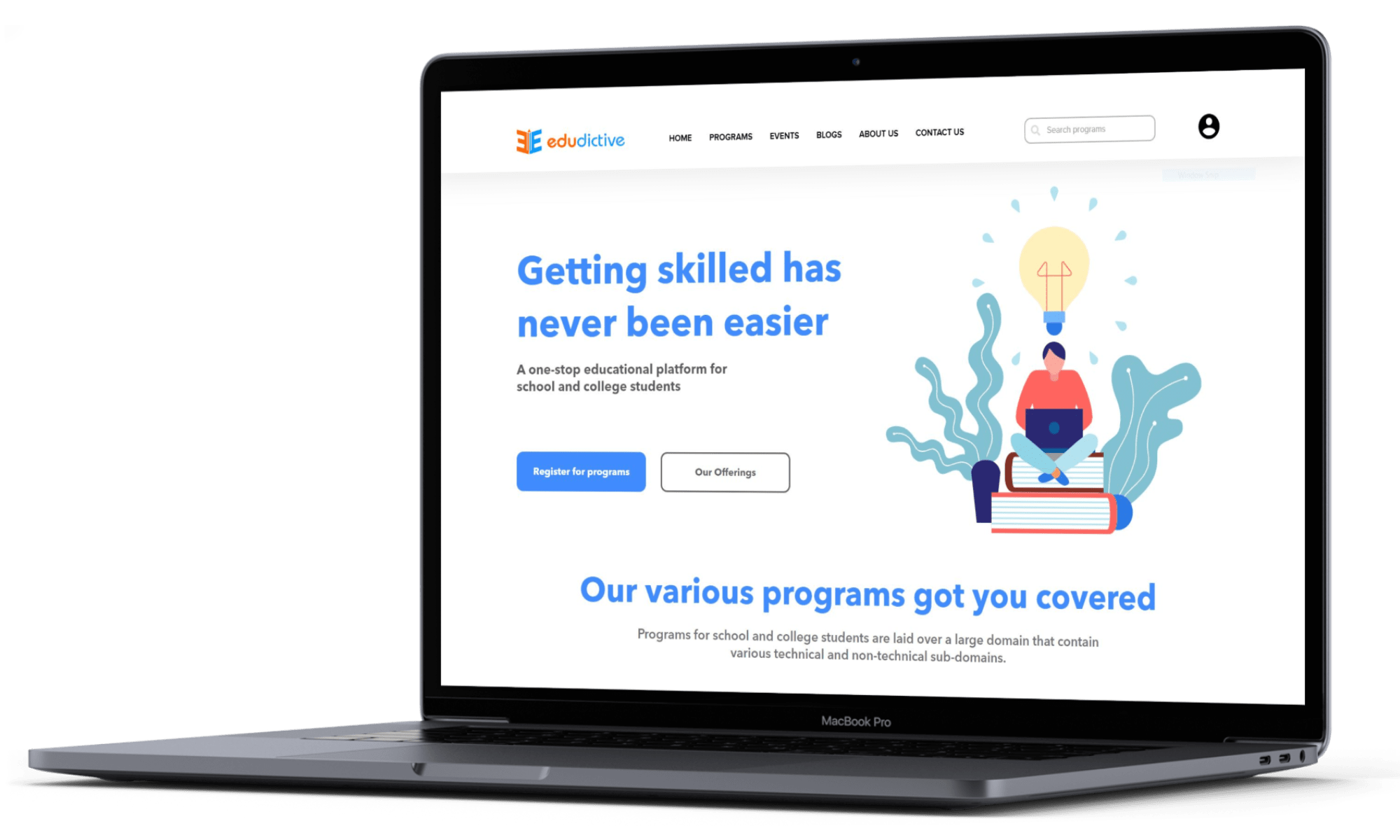
Here is how few of the screens from the platform look like:
Although this project is still being tested with the compatible audience for the platform, I decided to document my journey till now. Being my very first complete UI/UX project, I am thrilled that I could finally finish it. This was a very rewarding project to understand why UX and usability are more preferred over aesthetics at certain times and the vice versa at other times. It was exciting to build a product in the edu-tech domain as it is growing recently and it sure has a very competitive future with the announcement of New Education Policy 2020. While I definitely think that there are a lot of areas I need to improve upon, this is surely my first step in the right direction and I am very much excited for what the future holds for me.